Sunday, March 20, 2016

Improv

I was on the stage in front of about 50 people today.

I became a jail guard. I became a piece of cheese in front of a mouse. I became a prisoner trying to escape, which made the audience laugh out loud.

I was subtitling a Russian movie about gambling in Vegas.

I won a thumb-wrestling match for the first time after being defeated 50 times.

And I successfully assassinated the target and quietly walked out from the scene, which also made the audience laugh out loud.

These were all I did for my first ever improv theatre performance (Wikipedia). They were all I came up with on the spot, not planned ahead at all.

I never thought I could do something like this. But, after five weekly lessons since the beginning of February, I have become more spontaneous, being able to let my thought out without being judgemental about what I say.

It feels like the layers of my outer shell are peeled off one by one. And I enjoy seeing what comes out of the shell.

Saturday, April 19, 2014

Memory 03: First Love

While my life at the kindergarten sucked more or less, it was also the time I learned about the feeling of liking someone of opposite sex.

Pupils at my kindergarten went to the school in the morning together with others and their parents in the same neighbourhood. There was a girl, two years senior and naturally taller than me, who was very nice to me. Since I'm an only child and has no one of similar age among my relatives, it was my first experience of meeting an elder sister. I liked her. But I was a shy kid to the extent that I couldn't communicate my classmates.

She graduated by the end of the academic year, and I never met her again ever since.

This episode would repeat for the rest of my life in two ways: I'm attracted to a girl older (and often taller) than me; and I don't try to keep in touch with someone I'm fond of.

Friday, April 18, 2014

Memory 02: Kindergarten

By the time the second year of the kindergarten started, I finally joined the class activities although I don't remember anyone from those days except one.

During the second year, I was constantly bullied by a girl. I don't exactly remember how she bullied me, but I really didn't like her. Her bullying ended probably when the teacher intervened.

The third and final year of the kindergarten was probably a fun, even though I don't remember anything at all.

Thursday, April 17, 2014

Memory 01: Age 4

The first visual memory of my life is the morning view of the back of my mother, seen through the window of a classroom, leaving me behind at the kindergarten.

For the first several months after being enrolled at the kindergarten at the age of four, I refused to communicate with any classmate and just waited on the window side of a classroom for my mummy to come back and pick me up in the afternoon. I was such an introvert kid perhaps because it was the very first time to see anyone else of my generation. I don't have any brothers or sisters. I don't even have anyone of similar age in my relatives. In a suburb of Tokyo, neighbours are strangers. After four years of being surrounded only by my parents and my grandpa (my grandma died only a year after my birth, and I don't have any memory of the parents of my father for some reason), it was no wonder why I felt uneasy and didn't know how to communicate with other kids in the kindergarten.

Tuesday, September 10, 2013

Vision and Art: The Biology of Seeing, by Margaret Livingstone (Abrams, 2002)


I've read a fantastic book on the science of art. I'm so impressed that I even submitted my customer review to Amazon.co.uk. Before Amazon publishes it, let me publish it myself below.

The content of the book is fantastic. In a way, the book is about the history of European paintings from the neurobiology viewpoint. Although I wasn't a big fan of paintings, this book has made me start appreciating the works by Leonard da Vinci, Michelangelo, Impressionist painters (especially Claude Monet), and Pointillism painters. It also taught me the tricks behind the departure from representationalism by Fauves and Picasso. In addition, the book is useful to understand several principles of design. Design textbooks often mention that contrast and repetition are eye-pleasing, without explaining why. Color theory textbooks claim that complementary colors (red and cyan, yellow and blue, green and purple) enhance each other when placed side by side, without explaining why. This book provides the neurobiological reasons behind these design principles. Finally, the book also taught me scientific reasons why line drawings can represent what we actually see, which gave me confidence that I could be good at drawing from training.

What's unfortunate about this fantastic book is, however, the exposition. The structure of the book is quite confusing. The author's writing style is also sometimes confusing. I have to read three times to really understand what's written. I've figured out that the book has three big themes, repeated throughout the book. First, our vision is sharp only at the center of gaze while its resolution is quite coarse for the surroundings. This first theme explains why Mona Liza's smile is elusive. Second, the brain processes visual information in two parallel chains, one for only using luminance to recognize depth and motion (what is called the Where system in this book) and the other for using hues in addition to luminance to recognize shapes and colors (called the What system). The second theme explains why water looks flowing and simmering in Monet's paintings. Third, our visual system is responsive to sudden changes in luminance and hues while it is irresponsive to gradual changes. This last theme explains why we perceive the sunlight, incandescent light, and fluorescent light as all white while the iPhone camera does not. The neurobiological reasons for each of these themes are scattered around in the first six chapters. The description of how these three facts were recognized and exploited by painters throughout the history is also scattered around across Chapters 5, 6, 8, and 10. In Chapter 11, all these three themes turn out to be relevant for the sensation of Pointillism and Chuck Close, although the author does not explicitly says so. (Chapters 7 and 9 deal with additional materials, that is, perspective and stereopsis, the latter of which seems to explain why repetitive patterns are eye-pleasing.)

It's a bit like American sitcoms: three different stories are going on in parallel, and the scene busily alternates across the three to keep the viewer interested. Here in this book, it can cause an opposite effect: the reader may stop reading because he or she gets confused.

Having said that, reading this book three times taught me a lot. It has even enriched my life. Due to the poor exposition, I cannot give five stars. But I still recommend this book highly to everyone. It would be a great gift to your partner if you're into art but he or she is more of a scientific type. Once your partner has read this book, then you two can visit museums and galleries to appreciate art together.


Tuesday, August 06, 2013

Enola Gay


Sixty-eight years ago today, a bomber jet named Enola Gay dropped an atomic bomb in Hiroshima, a city in west Japan. Can we imagine how the pilot of Enola Gay felt when his boss gave him the mission, when he departed the hatch, when his jet was approaching Hiroshima, and when he finally pressed the button to drop the bomb?

A piece of instrumental music composed by the Japanese musician Sugizo may have an answer. It's entitled "Enola Gay". It features heavy metal guitar riffs and melodies, evoking the military mission. Inserts of a female vocal are non-lyrical, representing the speechlessness of the pilot's family, friends, and himself. The interlude in mixed meters sounds like the pilot's mental struggle, being torn by the duty to accomplish the mission on one hand and the human conscience on the other hand. Throughout the tune, however, the electronic kick drum keeps recording the passing moments mercilessly. The Enola Gay just proceeds forward to Hiroshima to complete the mission. The last two beats of the tune are the sound of the bomb explosion.

Americans argue that the atomic bombs helped the Second World War end more quickly than otherwise. If you visit the Yushukan museum in Tokyo (a museum of Yasukuni Shrine, enshrining the war dead including those found guilty of war crimes in the Tokyo Trial in 1946), you will feel that Americans actually have a case. (I blogged about my own visit back in 2006.) The Japanese military government at that time prepared for fighting against the US on the main islands of Japan until the very last Japanese person dies. Without atomic bombs, Japan could have followed the path of Paraguayans in the late 1860s.

What Hiroshima tells us is not just about how nasty atomic bombs are (and so we should ban their use). It is also about the danger of having an autocratic government completely detached from the interest of citizens and unstoppable without such cruel means as nuclear weapons.

But this kind of messages is not fun to hear for the vast majority of people, including many politicians in the world. Those who earn a living from selling nuclear weapons never listen.

A piece of art and entertainment like "Enola Gay" by Sugizo is perhaps more effective and memorable and will eventually change the world. True, this particular piece of music is not everyone's cup of tea. If various kinds of artists produce this type of piece of art in various styles, each catering to different tastes of different people, piece may really come forward. Am I too naive to think this way?


Friday, April 12, 2013

Version Control

This is a nerdy post, relevant only for empirical researchers in social sciences. It may also be relevant for those whose job involves the creation of tons of computer files to finish one project, though.

Matthew Gentzkow and Jesse M. Shapiro of Chicago Booth advocate the use of version control in empirical research of social sciences (See chapter 3 of their writing entitled "Code and Data for the Social Sciences: A Practitioner’s Guide").

If you are new to the idea of version control, watch a series of videos from Software Carpentry.

The basic idea of Gentzkow and Shapiro is that social science empirical researchers should think of writing data analysis scripts as developing software to be released to the public. We need to allow other researchers to replicate our empirical findings. For this purpose, we should make public all the codes and datasets once you publish the paper. It's often the case, however, that by the time you publish the paper, your computer directories are cluttered with many files unnecessary to produce the final results. And cleaning them up often ends up the inability of replicating the final results that you have obtained for the paper to be published. Version control can avoid such a problem.

However, it seems to me that the main benefit of version control is something else: to track the evolution of your thoughts on each empirical research project.

We empirical researchers often face a situation like this:

"Well, I need to analyze this particular thing. I think I did it a few months ago. Which files did I write for this purpose? I cannot find them in my computer."

So you have to start from scratch. A massive waste of time.

The branching function of version control (a great illustration can be found on section 3.4 of Git Pro, written by Scott Chacon) helps us avoid this problem. Every time you try out a new way of analyzing the data, create a new branch (call it the test branch). Within the test branch, keep developing your code. If it turns out to be a bad idea, you can stop working on the test branch and go back to the "master" branch. This way, all the new files you wrote for the failed idea disappear from your working directory. All the clutters are cleaned away. However, these files are preserved behind the curtain. If you later find the failed idea to be actually a good one, you can recover all the files you created in the test branch. Then, you can merge all these files in the test branch with those in the master branch very easily.

There are several systems of version control out there. Git appears to be the best one for branching. (And this article confirms my impression.) However, Git itself is a Unix-based software. Its user interface is not particularly friendly unless you are  a computer programmer.

Among a wide range of visualization software for Git (see the partial list provided by the Git official website), I find Gitbox the most intuitive. It's like an iPhone. Without reading a manual, you can use it. It runs on Mac OS. For Windows, I don't know which one is the best.

The only problem with Gitbox is that it does not visualize branches. Perhaps it is a good idea to also use another graphical interface software for the purpose of visualizing branches only. But it seems to me that none of the available software is very good at visualizing branches.

There is one issue with Git per se. It's a "distributed" version control system. That is, you keep all the files in your local computer and, whenever appropriate, sync them with a remote server (a bit like Evernote). And all the previous versions of each file will be stored in your local computer. This is fine if you only write ascii files. It's not fine if you "version-control" binary files such as data and images. If you use Git, therefore, it's a good idea to version-control those scripts to run statistical software only. Data can be reproduced by running those "tracked" scripts each time.

As opposed to the distributed system, there is also a centralized version control system (such as Subversion), which keeps track of file histories on a remote server. (See this article for the comparison of centralized and distributed.) The drawback of the centralized version control is that branching takes time (because each time you create a new branch, you need to download every file from the remote server). If the main benefit of version control is branching, then the distributed system appears to be the way to go.

Another merit of using version control is to make collaboration easy. It's an effective tool to avoid different people edit different parts of the project, ending up lots of conflicts that cannot immediately be resolved. For collaborative use of version control, however, your coauthors also know about version control (which is totally new to anyone in social science) and agree on when to create a new branch and when to "commit" your works. (To commit means to record all the file changes you have made so that they can be tracked in the future.) Which doesn't seem to be easy.

I'm still learning about version control. One thing that I have to figure out is to use Dropbox for version control. Freshmob and Sam Doidge suggest how to do it.


Tuesday, January 01, 2013

Top 10 posts of Econoclasm

The year of 2013 has started. This year I plan to revive this blog. To kickstart the reboot of this blog, however, I'd rather find out what I have done with this blog in the past. You cannot look forward unless you have a solid grasp of what lies behind.

This blog is hosted by Blogger, a blog service provided by Google. It records the number of page views of each post since May 2008. It might be interesting to report the top 10 posts.

No. 10: IMF Interview (October 25, 2006) - 477 views

Apparently, those who will have an interview with IMF arrive at this post after Google search. At that time, I was in job search and recorded every step in the process on this blog (to the extent it doesn't hurt my job prospect). And this interview with IMF went pretty bad. :) Don't ask me about macroeconomics even though I'm an economist.

No. 9: Yoshikitty :) (March 8, 2009) - 481 views

Quite a few of those X Japan fans seem to hit this post. I'm a big fan of Yoshiki. He's a Japanese musician who founded the legendary rock group X Japan. And he is probably the only rock musician in this world who is willing to collaborate with the world-famous Hello Kitty. :) This special Hello Kitty character takes its inspiration from Yoshiki's appearance in the early 1990s.

No. 8: A "cabaret club" (November 17, 2005) - 825 views

Those curious about Japanese sub-culture seem to view this post on a particular kind of service business in Japan. Seven years on, I still have never been to a cabaret club.

No. 7: The Berlin Wall Memorial (July 11, 2009) - 1598 views

Many of those visiting Berlin as tourists might find this post. In July 2009, I visited Berlin for the first time. This memorial is one of many, many things that I liked about Berlin, the city I've then visited for leisure four times more since then.

No. 6: Institut du Monde Arabe (March 7, 2006) - 1712 views

I think many reach this post via Google Image Search. I myself like the pictures that I took, especially the second one on this post. And it's a superb piece of architecture, representing Arab in a modern way. One of my favorite places in Paris.

No. 5: How do you eat mackerel? (August 21, 2005) - 2138 views

My recipe on picked skin-on mackerel appears to be popular. This is a post written when I got upset by a British recipe that removes the skin of pickled mackerel. I complained about supermarkets in London not selling fresh fish. Supermarkets in Stockholm sell fresher (if not as fresh as those in Tokyo) fish, but the variety is rather limited, and all those white fish popular in the capital of Sweden do not taste really good to me. So I rarely cook fish other than salmon these days.

No. 4: Mendeley, Sente, or Papers? No, Zotero and iAnnotate will do (October 7, 2011) - 2579 views

A nerdy post actually gets a lot of visits because it hits the niche. Every time I spend a lot of time to find out what other people with similar interests would benefit from, I'm willing to share what I've found, and hence this post.

No. 3: Cathedrale Notre-Dame de Paris, the east side (March 7, 2006) - 2735 views

I don't really understand why this post is popular. Maybe it's unusual to see the picture of the eastern side of the Notre-Dame cathedral even though it can be more beautiful than the facade (which I recently learned is different from the original design which includes Gothic towers above). Incidentally, a reader's comment is rather hostile. :)

No. 2: Centre Pompidou, the back facade (March 8, 2006) - 2850 views

It appears that putting a nice photo of famous architecture is one effective way to increase the traffic to your blog. Personally I don't really like Centre Pompidou, both its architectural style and what's exhibited inside, though as a promotion of a contemporary art museum in the late 1970s, this design must have been very effective.

No. 1: How to "Save As ..." in Excel 2007. (July 30, 2009) - 10727 views

Obtaining by far the largest number of visits, this post has also received as many as 42 comments most of which thank me rather enthusiastically. The best way to attract people to your blog turns out to be finding a flaw in Microsoft's software design and provide solutions to it, because so many people (still) use Microsoft software, and they are badly designed.

Monday, December 31, 2012

Why is January 1st the beginning of a year?


Why on earth is January 1st the first day of a year? A year in the solar calendar is defined as (roughly speaking) the time it takes for the earth to go round the sun. If so, why doesn't a year start on, say, the spring equinox or the winter solstice?

A bit of Google Search reveals the following facts.

Around 753 BC, Romulus, the founder of Rome, created a solar calendar that indeed began on the spring equinox. He created 10 months of 30 or 31 days, starting from March to December. (This is why September originally means the 7th month in Latin, October 8th, and so forth.) Interestingly, he left the remaining winter days after the end of December unassigned to any month. In those days, winter days were probably of irrelevance as nothing could grow. What turns out to be important is that the names of the first four months (March to June) are derived from Roman gods.

Around 713 BC, Numa Pompilius, a king of Rome, reformed the calendar, adding January and February after December. These two names also originate from Roman gods. Especially, January refers to Janus, the god of doors.

Then came Julius Caesar. In 46 BC, he reformed the calendar to create what is now known as the Julian calendar. Famously, he gave his own name to the month after June, that is, July. (And then the succeeding Roman Emperor Augustus, jealous of Caesar, gave his own name to the month after July, that is August.)

Up to here, the source of information is the Wikipedia article on Roman calendar (as of 31 December, 2012).

Now, lesser known is the fact that Caesar declared that January was the first month of the year because it was the month dedicated to Janus. As mentioned above, Janus is the god of doors, which symbolize the beginning and the transition. He has two heads, one looking to the past and the other to the future. Caesar thought Janus should be the god for the first month of a year.

Janus on a Roman coin from the 2nd century BC (borrowed from here).


After the demise of the Roman Empire, each region of Europe adopted different dates of the New Year's Day (e.g. Christmas Day, Easter Sunday). Overtime, however, they converged to January 1st, mostly when they adopted the Gregorian calendar, the calendar that Pope Gregory XIII devised by reforming the Julian calendar and that most of us in this world use today.

The last two paragraphs are based on Matt Soniak "Why Does the New Year Start on January 1?" Mental Floss, December 31, 2011.

So today we (excluding those in Saudi Arabia, Ethiopia, Iran, and Afghanistan according to Wikipedia on civil calendar) celebrate the New Year's Day on a day when the Earth positions itself in a particular, rather random, location on its orbit around the Sun, for the reason based on Roman mythology and an idea that probably just popped into Caesar's head.


Friday, March 30, 2012

Survival analysis

If you are a Stata user with lots of experiences of conducting statistical and econometric analysis but have never learned survival analysis before, An Introduction to Survival Analysis Using Stata, written by Mario A. Cleves, William W. Gould, and Roberto G. Gutierrez is the best way to go through a crash course of survival analysis on your own. I've never read any textbook of statistics or econometrics as easy to follow and practical as this one.

Monday, January 09, 2012

Fly Inn restaurant at Helsinki Airport Terminal 2

If you use Helsinki Airport Terminal 2 for flying to other European destinations, take half an hour to eat at Fly Inn restaurant, located inside the security checkpoints. Its tree-featured interior provides the coziest atmosphere in the airport. Have the Fly Inn salad, green leaves with marinated tomatoes, watermelons, and lime vinegar dressing. This lime vinegar dressing is awesome. Complimentary bread is decent along with rock-salt-sprinkled butter.

Monday, January 02, 2012

21st century Japanese calligraphy

One of the traditional things to do in Japan on 2nd January is kakizome or the first calligraphy of the year. So I'd like to share with you a 21st century form of Japanese calligraphy (named "kuhsho" or spatial calligraphy) invented by Team Lab in collaboration with professional calligrapher Sishu. Enjoy.

美の壺(binotsubo) from TEAMLAB on Vimeo.

Sunday, January 01, 2012

Your neighborhood greengrocer

About a few minute walk from my parents' place in an eastern suburb of Tokyo, a greengrocer still remains in operation. My mother is a regular customer, and the store owner tells her whether each vegetable and fruit is worth buying  each day. He goes like, "Grapes from Yamagata (a prefecture in northern Japan) are great. Those from Yamanashi (another prefecture immediately to the west of Tokyo), though it is famous for grapes, are not very good." According to him, the best potatoes come from Mikatagahara (near Nagoya), onions from Awaji (an island off the coast of Osaka), and so on.

Such a greengrocer in your neighborhood enriches your life. Compare this to shopping vegetables and fruits at the ubiquitous supermarkets. There is no one whom you can ask which oranges are good. Each day they just put vegetables and fruits in bulk on the shelf. Customers cannot tell whether today's "harvest" is better or worse than usual. The only information you get is the price.

On the other hand, there's no fishmonger in my parents' neighborhood. My mother ends up buying fish at a soulless supermarket, and my parents complain that their fish doesn't taste good.

Ranting against supermarkets may sound like an out-dated anti-modernist complaint. But think about it. Do you enjoy going to a supermarket to buy foods for today's dinner? If the shopping involves the encounter with a food connoisseur like the greengrocer in my parents' neighborhood, even the process of shopping becomes fun. Greengrocers are like DJs for music, curators for art, journalists for world events, consultants for corporate management, or interior designers for opening an attractive shop.

Saturday, December 31, 2011

Grand cleaning

In Japan, the last few days in December is when people clean up their home on an extensive scale (we call this oo-soji or grand cleaning). And today I helped my parents do this grand cleaning, well, only a little bit. :P

Which reminds me of what I always don't understand: why is any modern house designed to be difficult to clean up? Perhaps talented, influential house interior designers in the Western world only have wealthy clients who can afford hiring house cleaners and thus never care about whether it is easy to clean.

Sunday, December 25, 2011

The Monocle Cafe

Every half a year, Tokyo sees something new. The latter half of the year 2011 saw the opening of Hankyu Men's Tokyo, a department store specializing in men's fashion, in Yurakucho (the area right next to Ginza). Although it may sound unusual to people outside Tokyo, the whole department store building dedicated to men's fashion is nothing new in Tokyo: Marui Men for youngsters and Isetan Men's for grown-ups have been around in Shinjuku for ages by now.

What's really new about this department store is a cafe on the lower ground floor: The Monocle Cafe. Monocle is a magazine that has been advocating for the ideal urban environment which, of course, includes cafes. Perhaps unusual for such a magazine, the editor Tyler Brule has decided to open the magazine's own cafe in Tokyo.

Omotesando Koffee, one of the best coffee houses in Tokyo, is in charge of coffee served. The food menu includes katsu (Japanese pork schnitzel) sandwiches, which consist of a succulent pork fillet, crispy deep-fried breadcrumb, thick tonkatsu sauce, and slices of toasted smooth-textured bread. It's probably one of the best katsu sandwiches served in Tokyo.

But the Monocle Cafe is not only about coffee and foods. The wooden interior design, implemented by Maruni, a Japanese wooden furniture manufacturer in business for more than 80 years, creates a heartwarming atmosphere. Especially, their Hiroshima lounge chairs, designed by Naoto Fukazawa, the leading Japanese product designer, have such a smooth, beautiful surface of the back rest that is comfortable both to lean against and to watch when the chair is not occupied.

Last but not least, the cafe staff is super customer-friendly, even by judging from very demanding Japanese standards of service quality. When the kitchen ends up serving a different food than the one I order, they don't just apologize but first throw away my cup of espresso to replace it with the one just brewed in time for my food served. Then they deliver everything to my table (by default, customers order coffee and foods at the counter and take them themselves to their table). When I realize I need some sugar for my espresso, the waiter standing nearby just notices it and brings a sugar container to my table. This kind of services can be overwhelming to customers, but the Monocle Cafe staff know how friendly services do not feel too much.

Also great about this cafe is that customers can read a sample Monocle magazine and that some of the tables offer electric sockets.

When you visit Ginza, do stop by at this cafe. You won't get disappointed.

Added on 8 January
On the second visit, I had Monocle curry (curry with rice in Japanese style) and yuzu squash (Japanese citrus sparkling juice). For foreign visitors, these must be interesting. But for Japanese people, they are nothing special. And today's staff was less professional. Another problem is the cafe's WiFi access. You first have to email a blank message to obtain the password to get access. For foreign visitors like me who have no 3G internet access, this is super useless. Having said that, it's still worth visiting for cozy interiors, katsu sandwiches, and Omotesando Koffee's coffee kashi.

Saturday, December 24, 2011

Rolex Learning Center, and the future of architecture exhibitions

I visited an exhibition entitled "Architectural Environments for Tomorrow" held at the Museum of Modern Art Tokyo. Co-curators of the exhibition are the Prizker prize-winner Japanese architect duo SANAA.

The exhibition begins with a model of the Rolex Learning Center, designed by SANAA, and ends with a short, looping 3D movie entitled "If Buildings Could Talk" by Wim Wenders, which features the Rolex Learning Center. There are a few other interesting installations by other architects and artists (the boundary between architecture and art is increasingly blurred these days), but at the end of the day, the whole idea of this exhibition seems to be symbolized by this SANAA creation.

The Center, located in the campus of Ecole Polytechnique Federale de Lausanne, is a future of the college building. Three things characterize the building, all of which enhance the academic and learning environment. First, it is a one-floor building with no wall separating rooms. You can easily spot where your buddies are. In an academic environment, the exchange of information and opinions out of casual meetings is often quite important a trigger for coming up with (and triaging) new ideas. If your friends, colleagues, and acquaintances hide in a room, upstairs, or downstairs, this won't happen. I myself experience a tall wall between different floors in an academic building, both in London and in Stockholm. It is really tall. Trust me.

The second feature of the building is light. Floor-to-ceiling glass windows separate the inside and the outside of the building throughout. There are several circular "courtyards" which allows the sunlight to flow in to the area far away from the outline of the building. The wavy building structure allows the light and the shade created by the sunlight to change over time in a day not in an obvious way.

Finally, the hills. The floor of the building is a rolling field. There are gradual, organic slopes up and down. It is like a park. And in a park, people often go up on the hill and sit down there to get relaxed with the vantage point view. The hill slope also helps people to lie down in a natural way. With the light flowing in and the distance view thanks to the open-plan one-floor structure, the inside of the building can play a role of a park with hills.


What's important in studying is taking a break from time to time. Hard-working is important, but breakthrough ideas often occur to people's mind when they feel relaxed after hard-working. Very few academic buildings can provide researchers and students with this relaxing atmosphere. The Rolex Learning Center just does that.

Now, everything I just wrote here is what I noticed by watching the Wim Wenders's 3D movie of the Center, by sitting close to the screen on the floor with low-height sofas to lie down against, so that I feel like I were actually inside the building. (The movie does show students lying down on low-height sofas placed on those slopes.) The Learning Center's model that I saw at the beginning of the exhibition didn't really help me understand SANAA's design concept this way. Here I saw the future of the exhibition on architecture. Understanding architecture (or space design in general) without actually visiting it is essentially impossible. Most exhibitions on architecture face this problem. With 3D movies, this eternal issue can be resolved as Wim Wenders successfully did.

Seafood in Japan

A good friend of mine took me to his favorite upmarket sushi restaurant. Since it was the last minute booking, we ended up at "table seats" instead of "counter seats" and because of this, the waiter on the phone apologized to my friend. I, as a Japanese person brainwashed by European dining culture, thought sitting at a counter in a restaurant was inferior to sitting at a table. In a proper Japanese restaurant, however, it's the other way around. Sitting at a counter is more desirable, perhaps because the chef works inside the counter and sitting at the counter allows customers to see how the chef cooks foods.

I didn't know this before. I'm foreign to Japan.

At a luxury sushi restaurant, you don't eat sushi only. You start with other seafood dishes. So we first had raw oysters with ground black pepper. I didn't know black pepper goes well with oysters. Then we had two kinds of fish grilled: nodoguro (also known as akamutsu) and mehikari (also known as aome-eso). Both tasted impressive (and I'm frustrated as I don't have enough vocabulary in English to describe the subtle taste of different kinds of fish).

The variety of fish eaten by Japanese people is just beyond my memory capacity. The other day, my mother served sashimi of sayori and kohada (which is the name of a child konoshiro). Some fish even changes its name as it grows (kohada is an example). For most of the fish, the translation into English doesn't make any sense as foreigners don't eat them. So I just use the Japanese names here.

Friday, December 23, 2011

Omotesando Koffee

If I'm asked to recommend the best coffee shop in Tokyo, I immediately mention Omotesando Koffee because it combines the Japanese tradition and the 21st century design philosophy at its best.

The traditional side is represented by the house that houses the shop. It's a small, old-style residential house. Facing the alley is an old-style wooden gate with a roof. Inside the gate spreads a small garden surrounded by a concrete block wall (typical of the mid-20th century Japanese urban landscape) and a wooden house. A narrow flower bed along the wall accommodates non-conspicuous flowers and grass plants.

Inside the house sits a cubic kiosk within which the shop owner brews and serves coffee to customers over the counter. The design of the shop is all based on the cubic shape. The signage at the entrance on the alley is a black metal square ring on a stand. The white paper menu on the counter divides its surface into multiple squares each of which lists one particular coffee (espresso, macchiato, cappuccino, etc.). Each component of the kiosk is also a cube, since it's meant to be mobile: the house is planned to be demolished soon (though the house owner just decided to postpone the plan). Finally, the koffee kashi, the original baked custard designed to stimulate your appetite for coffee, is cube-shaped. All this consistent design philosophy, along with the interior of a Japanese old residential house, creates a tranquil atmosphere, tranquil enough to focus your five senses to the present moment of tasting coffee.

There's no seat or table inside. The shop is more of an Italian bar where people just hop in and quickly gulp a cup of espresso. It is in the middle of a quiet residential area three blocks away from the busy Omotesando boulevard. A little bit difficult to spot, but it is worth visiting as nowhere else can offer such an experience.

If you need a second opinion, I would mention that Monocle magazine editors love this place so much that when they opened their own cafe on the basement of Hankyu Men's department store in Ginza last autumn, they asked Omotesando Koffee to train their barristers and decided to serve its coffee and koffee kashi at the cafe.

Thursday, December 15, 2011

Hackney Pearl

The Hackney Pearl (11 Prince Edward Road) is a cafe located within a minute walk from Hackney Wick London Overground station (one station to the west from Stratford). Once you get off the station, you might wonder if you come to the right place, as the area is quite run-down. But you are right. The cafe is located almost like in the middle of nowhere. Still, it is one of the best places to eat in London. My onglet steak (for 15.50 pounds) was simply awesome, the best steak I've ever had in years. The staff is super friendly. The decor is homey, in stark contrast to the landscape through the floor-to-ceiling windows facing the street (which increases the feeling of coziness inside). If you visit London for the Olympic Game next year, it's worth a trip.

Monday, December 12, 2011

Pinchito

There are quite a few Spanish tapas restaurants in London. But most of them are rather disappointing. Pinchito Tapas, a couple of minute walk from Old Street station, is an exception. The black-and-red interior invites you to the trendy Barcelona bar atmosphere, vibrant with Spanish-speaking customers while maintaining the right amount of noise. Each tapas dish is presented beautifully and tastes delicious. The service is proper.

Saturday, November 12, 2011

Another discovery in Stockholm

I've finally discovered a Stockholm cafe that I like in every aspect: coffee, food, the interior, and the appropriate level of business (ie. some seats available).

It was totally by chance for me to discover a cafe called Foam. The other day I was walking on Karlavägen, a pleasant boulevard in the poshest district of Stockholm known as Östermalm. I noticed a rusty blue metallic door with cute-looking tiny windows in an otherwise standard-looking building on the street corner.


It looks like an entrance to a hip bar or something. But it was in the early afternoon, and I saw some people entering and exiting from the place. Out of curiosity, I entered the place.

Inside spreads the interior rather different from what I imagined from the entrance door appearance. I immediately liked it without understanding why. Customers are all well-groomed and trendy types. I just had a cup of espresso quickly. It tasted slightly sour, but within an acceptable range (unlike coffee served by many other cafes in Stockholm).

Today, I revisited the cafe for lunch. I didn't expect much in terms of foods, honestly speaking. But my sourdough bread toast sandwich with tomato and mozzarella, when served, smelled very nice. I never had this pleasant smell when I had a toast sandwich in Stockholm. It turns out that they use tapenade (Provencal paste of olives, capers, and anchovies) to make the otherwise standard toast sandwich a bit different. (Sourdough bread is so popular in Stockholm right now). And it tasted excellent. Accompanying salad was also pleasantly fresh (which is not easy in Stockholm's winter).

And a glass of cafe latte tasted very good. It's unusual for me to get satisfied from both foods and coffee in a cafe in Stockholm (the only exception is Mellqvist Kaffebar).

Then I looked around, trying to understand why I like this cafe's interior. The cafe comprises three materials that would usually look mutually incompatible: birch wood, grey concrete, and shocking pink plastic and textile. (It may not be birch or plastic, but what's important is what they look like.) Each material dominates one of the three sections in the cafe, and what's stunning is that the diagonal boundary between these sections (also the edgy shape of the wooden counters in the concrete area) makes the transition very smooth. As a result, the cafe has an integrated atmosphere that's unique. Randomly hung hand-blown glass lamps just enhance the vibe.


Depending on your mood, you can choose which section of the cafe to sit down. If you want to relax, go to the birch section.
If you're passionate, have a seat at the shocking pink section.
If you feel inorganic and modernist, stay at the concrete area. The presence of the other two sections, however, adds the cool feeling to wherever you settle.

Once you understand this, the totally-different looking rusty-blue entrance door now makes sense. It cannot be birth, concrete or pink. It should be something totally different AND provocative enough for walkers-by to peek in (as I did). Once you open the door, you cannot help saying, "Wow."

The cafe interior was designed by Note Design Studio.

Saturday, November 05, 2011

Stockholm as one of the best travel destinations

My feeling that Stockholm has been getting a lot more exciting in the past couple of years seems to be not so totally off the mark.

Worldwide travel guides such as Lonely Planet and Rough Guide pick Stockholm as one of the top 10 destinations this year. Lesser-known but more trend-conscious city guides such as Shift City Guide and Nectar & Pulse fail to miss Stockholm among their list of cities.

Perhaps I made a good decision to stay in Stockholm rather than running away after the first few years of dismal life (as you can tell if you read the previous posts on this blog). :)

And a couple of more discoveries in Stockholm: this time design shops in SoFo: Manos and Kiki. Both are on Renstiernas Gata, the street running north-to-south on the eastern part of Södermalm. I personally believe that SoFo, the bohemian district of Stockholm, is way too much overrated, but these two shops deserve such a hype.


Thursday, November 03, 2011

Some of the recent discoveries in Stockholm

Living in Stockholm is getting more interesting these days, partly because more and more unique and interesting places are opening up (such as Serrano and ZeeSide). But it's also because I was simply out of luck in the past four years: I didn't have a chance to visit a decent place, and even if I had, the place was packed with people and I was forced to leave for another mediocre place.

First, those newly opened. Restaurang Volt. I took a foreign visitor to our workplace to this restaurant a few months ago. In my view, this restaurant is simply the best in Stockholm. On the menu, they only mention ingredients. How meats or vegetables are cooked is totally hidden. Once they were served, it was clear why. For example, if you order carrots as the starter, carrots are cooked in several different ways (pickled, mashed, fried, etc.), a small portion of each is served on a plate. You'll be delighted by different textures and tastes out of the same ingredient. They also serve unusual drinks such as orange wine. If you want to enjoy a bit different dinner, this is the place to go.

Another newly opened place that I discovered recently is Juiceverket. What they serve is similar to Joe & The Juice in Copenhagen or Forbidden Fruit in Tokyo: freshly squeezed mixed fruit juice, smoothies, and nutritional boosters in a shot glass. But what's unique about this place is its interior. Very much inconsistent with our image of fruit juice, the wall behind the counter and the floor is what can be called rusty chic (which is by the way VERY unusual in fastidiously-clean Stockholm). Placed on the shelf are an antique television set, old books, mid-century jewelry boxes, and the like. Fruits are tacked together on one corner, unusual for a juice stand where oranges and apples and so on tend to dominate your sight. And I really love this place. It was only opened two months ago.

Then those that have always been there since I moved to Stockholm but which I didn't have a chance to visit until recently. Haga Forum. If you want to have a relaxed and tasty weekend brunch in Stockholm, this is the place to go. A view of the lake through the floor-to-ceiling windows and a restrained appearance of tables and chairs along with decently-cooked Swedish foods on a buffet create a cosy atmosphere from which you don't wanna leave.

Another gem found in Gamla Stan (the oldest part of the city) is Chaikhana (CAUTION: the linked website of theirs starts playing atmospheric music). The last time I came here, it was a winter Saturday and the place was packed (they don't have many seats here). On a weekday afternoon I recently visited the place, there were a couple of seats available. This is a colonial British India tea house (or so I feel). They serve a wide variety of proper tea (by which I mean NOT herbal tea or flavored tea). They also serve English afternoon tea with deliciously made sandwiches and cakes (I haven't tried English scones with clotted cream, but they do serve them). When they serve tea in a pot, leaves are taken away. So your second and third cup of tea tastes the same as the first one. When I asked for milk, they asked me back, "Cold or hot?" Milk for black tea has to be cold in my view (which is also what I heard as the proper way to drink milk tea), but they allow your preference to be reflected. Very professional. And if you like the tea you had, you can buy the leaf with a 10 percent discount. This is how all tea leaf sellers should do: have a cafe space and let customers try out different kinds of tea in a way they would enjoy tea at home (instead of serving tea in a tiny cup for trial). They also sell tea leaves by Mariage Freres, my favorite French tea house. I thought their leaves can be bought only when I visit Paris or Tokyo. But I no longer need to rush to Mariage Freres shops while being on a trip. In general, Swedes do not like tea unless it's flavored or herbal. Stockholm lacks a decent tea house that properly brew tea except Chaikana, an oasis for tea lovers in the capital of Scandinavia (I apologize to those in Copenhagen).

Friday, October 07, 2011

Mendeley, Sente, or Papers? No, Zotero and iAnnotate will do.

This is a nerdy blog post, relevant only for researchers.

Every researcher needs to read academic papers. I often do this while commuting or being away from office. It often happens that I don't have a hard copy of the paper that I want to read while being away from office. I never know which paper I want to read in advance.

With the advent of iPad, this problem can be solved by storing all the academic papers in iPad. But that's not the end of the solution. Two more things need to be solved: annotation and bibliography management.

I often highlight some sentences in an academic paper. I also often add a note to the paper. I even sometimes draw a simple graph on the paper. This needs to be done on the iPad screen.

Plus, I need to manage bibliography. Currently, I'm using Zotero for bibliography management, but this Firefox plugin doesn't allow me to read a PDF file with the annotation function. Ideally, every time I download a PDF copy of an academic paper onto iPad, a new entry should automatically be created in this bibliography. Then it's going to be easy to create the section of references in my own paper, in my lecture syllabus, or in an email message that I write to refer my colleagues to the papers they might be interested in.

It seems there is no perfect solution for all these. Partial solutions are provided by Sente, Papers, Mendeley, and iAnnotate.

If I don't need to use an iPad (which is totally out of question but...), Mendeley is the best solution because you can automatically sync with Zotero, which is still the best solution to easily create bibliography while downloading a PDF file of the paper. After visiting the webpage of an academic paper in Firefox, click the reference icon that shows up on the address bar of the Firefox, and then bibliography information will be stored to Zotero and thus to Mendeley. Then download a PDF file from the same webpage to a folder on my desktop computer and drag the icon to Mendeley window. This allows me to read the PDF file on Mendeley, which allows me to annotate.

The problem with Mendeley is that its iPad application does not allow you to annotate. How stupid it is.

Annotation on iPad is not a problem with Sente or Papers. But both are rather poorly designed in terms of the automatic bibliography entry creation while downloading a PDF file of the academic paper. Plus, Sente's annotation function is stupid in the sense that you cannot associate your note to a particular sentence that's highlighted. Notes are only associated with a page.

In terms of annotation on iPad, iAnnotate seems to be the best application. However, it doesn't come with the bibliographic management function. An ideal solution is to combine iAnnotate with Mendeley, but Mendeley does not allow you to read the PDF file annotated with iAnnotate.

What makes things worse is that any of these iPad applications (Sente, Papers, and iAnnotate) is not free. There's even no trial version. Each costs less than 10 US dollars, but should I buy all of these to test which is the best among available?

It seems that's the way to go in the world of Apps. Buy several alternative applications for your iPad (or iPhone) and choose the best....


UPDATE:
It seems the quick solution is to use Zotero for bibliography management and iAnnotate for annotation on iPad (with Dropbox used for transferring PDF files from the desktop computer to iPad).

Zotero is very powerful. When you log on to a webpage of an journal article, the address bar shows an icon which can be clicked to create a new entry in the bibliography AND to associate this entry with the link to a PDF file on the web. Clicking this PDF link allows me to save a PDF copy. Since I don't use Firefox for any other purposes (Google Chrome is much better to surf the net), I can set a Dropbox folder for PDF copies of academic papers as the default download folder.

Then on iPad, launch iAnnotate, click the download button on the top-left corner (which shows the list of folders in my Dropbox), then click the PDF copy folder. This updates the list of PDF files in iPad. You need a WiFi for syncing PDF files between the desktop computer and the iPad, but in my office there is an eduroam wireless network. So there's no problem.

So, after reaching a webpage of an journal article, I only need to click four times (twice on the desktop and twice on iPad). Then I'm able to read a PDF copy on iPad. This is very efficient.


Sunday, August 21, 2011

Akio Hirata versus Nendo at Spiral Garden


Back in June, the Spiral Garden in Omotesando of Tokyo featured a retrospective exhibition of hats designed by Akio Hirata. Hirata, aged 86, has been the top hat designer during the last few decades. This retrospective exhibition, however, turned out to be an unusual one, thanks to Ooki Sato, a leading designer under the alias of Nendo, in charge of exhibition design. It also attracted a lot of attention. The original 12-day exhibition period was extended for one week. See this page for the photos of exhibition.


About a month on, Excite Ism, probably one of the best online magazines in the field of design in Japan, published the interview of both Hirata and Nendo. It reveals behind-the-scene episodes of this exhibition, which is intellectually stimulating in terms of design process.

The basic idea of exhibition is to display Hirata's hats among milliards of white, ordinary, mass-produced hats so that Hirata's originality will be enhanced in the eyes of viewers. It is true that Hirata's hats are very original. It makes you realize that the shape of a hat can be so flexible even though the purpose of a hat is usually thought to constrain its shape. Originality will be enhanced if it's surrounded by ordinariness.

Another key word to describe Hirata's hats, says Nendo, is freedom. Not a single hat looks similar. Therefore, it is inappropriate to show his hats in a standard, one-dimensional way of exhibition. Viewers should freely walk around and should feel the way they feel about these hats, rather than the way the curator describes them.

So what Nendo came up with is a space with white, mass-produced hats floating in the air rather randomly as if these white hats were clouds in the air. Although the interview doesn't mention this, I imagine those mass-produced hats should have been nothing else but white. White is the color of nothing, the farthest end of the spectrum from Hirata's originality. Now, these white hats should be hung in the air, not on the ground or on the raised platform, because that's how a hat is worn. A hat is raised above the ground but hung in the air by the person who wears it. When these white hats are hung in the air in a way of freedom, it must have been a logical progression to see them as clouds. This analogy gives an extra meaning to the way viewers see these hats by random walk: straying amidst floating clouds, which is a day dream or a fantasia. And each of Hirata's hats is a fantasia.

The interview also reveals that Nendo's initial idea was actually modified and enhanced by Hirata, who slightly changed the design of these white hats. Which is not Nendo's intention. However, once these white hats came to life under the supervision of Hirata as the professional hat designer, the space itself also came to life. Once each white hat became beautiful, says Nendo, the whole space also became beautiful. This episode reveals that good design comes out of interactions between designers, not solely from one individual designer's own idea.

Another important element that led to the success of this exhibition is the material used for those white hats. Nendo chose Smash, which is "a unique non-woven polyester fabric developed by textile company Asahi Kasei" (in the words of a Wallpaper magazine article). Since Hirata often uses natural fabric, Nendo says, the latest chemical fabric would make a great contrast. But it turns out that Smash creates a nuanced light reflection just like the real clouds.

The gallery space is also unique in the sense that it's got a high ceiling and there is a spiral staircase that surrounds a spacious circular exhibition space at the rear. Thanks to this structure, viewers can observe the cloud of white hats from above as well as from below, allowing them to appreciate Hirata's hats even more because Hirata's design changes its appearance depending on from which angle you look at it.

Nendo's design concept of creating an exhibition space in stark contrast to Hirata's hats, Hirata's professionalism as a hat designer, the unique structure of the exhibition space, and the characteristics of the material used (Smash) all interact with each other, often unintentionally, to enhance the attractiveness of Hirata's hats to full extent.

I believe that good design is the one with solid logical backing. This exhibition is an example where such solid logical backing was created by unintentional interactions of designers, although such "unintentionality" probably didn't materialize without Nendo and Hirata's consistent approach to design.

Tuesday, August 16, 2011

Chinese wife diary


This is the logo for a comic book written by a Japanese otaku man of age 40 who got married to a 20-something cute Chinese girl. The comic is about this Chinese wife who, by speaking broken Japanese (which makes her even cuter in the Japanese men's mind), makes the author (and the reader) notice the daily-life difference between Japan and China and what contemporary China feels like. Just releases last week, it has become the top selling comic book at the Amazon.co.jp online book store. The book is a collection of blog posts by the author, and so you can enjoy the cartoons here (not in China, though, as the hosting blog site is blocked by the Chinese government).

The logo, designed by manga comic book editor-designer Hideki Satomi, is praised by the author Junich Inoue as emanating the lovey-dovey feeling.

Why? What makes this logo lovey-dovey?

First of all, the font. It looks like the kind of letters young Japanese girls (maybe Chinese girls as well?) often write. The first two and the last two kanji letters do not enclose any space, suggesting something loose and sentimental.

Second, the five yellow stars (which must be those five stars in the Chinese flag), one red circle (which must come from the Japanese flag), a crescent (which may suggest sleeping at night together), and a heart that follows the kanji letter whose meaning is a wife) are all scattered around, to symbolize happiness as a result of sense, not of reason.

And finally, the central kanji letter whose meaning is a wife is slightly bigger than the other four, indicating that the husband has a slight inclination to show off how cute his wife is.

In addition, this kanji letter in the center is the combination of the letter signifying a woman (the left half) and the other meaning a home (the right half). By scaling this letter up a little bit, we feel the happiness of the guy who has got a woman at his home.

The color of red is used maybe because this is the color shared by both national flags of China and Japan, bearing some analogy to the international marriage or simply because the color of China to most Japanese people is simply red (not because they are communist but we traditionally associate China with red).

Monday, August 15, 2011

Why Apple?

If I remember correctly, their first sensation was the blue first-generation iMac. By now, almost every commercial image with a desktop computer (either in an advertisement or in a shop) comes with an iMac, not a Dell or a HP. Then the iPod, whose design has become the standard in the portable digital music player industry, and the iPhone, whose design has become the standard in the smart phone market, and most recently the iPad, whose design is quickly becoming the standard in the electronic book reader industry.

I usually go for what everyone else does not have. By now, however, my desktop PC is an iMac (both at home and in office); my laptop a MacBook Air; my portable digital music player an iPod Classic; my mobile phone an iPhone 4 White; and I'm now thinking of buying an iPad 2 after learning that Amazon's Kindle doesn't really satisfy my needs. And the reason is there's something irresistible about Apple's product design.

I always wonder why Apple always manages to come up with what can be called the universal design. All the other manufacturing companies end up copycatting Apple's design and end up with inferior design to Apple's (the only possible exception is Naoto Fukazawa's Infobar). I'm not an expert in industrial design. In particular, I have no knowledge of electronics. So it is impossible to answer this question in a fundamental way. But that doesn't discourage me from thinking about this puzzle.

One of the keys seems to be thinness. Apple makes a lot of engineering effort to make products thinner than those produced by competitors. And thinness appeals to us as consumers, perhaps because almost every electronics product wasn't thin before. What's attractive as an image often coincides with what's not been available so far.

But this explanation seems only part of the whole story. It's probably also about simplicity or simple-looking appearance. Electronic gadgets tend to have multiple functions, which leads to too many bottoms on their surface. But perhaps not a single consumer will use them all. There is a gap between how consumers use the product and what the product looks like. Apple successfully narrows this gap. It's perhaps nothing surprising that Naoto Fukazawa manages to come up with a smart phone design that goes on par with iPhone, because that's exactly his design philosophy: narrowing the gap between how consumers use the product and what the product looks like.

(To be continued.)

Friday, August 05, 2011

How was flash memory invented?

Fujio Masuoka, a former is the inventor of flash memory, the data storage chip used worldwide in mobile phones, digital cameras, and MP3 players. The August 1st evening issue of Asahi Shinbun (a Japanese newspaper) features his interview in which he reveals how he invented flash memory.

When he joined Toshiba, he first worked at the research and development department. He invented a high-performance memory chip, but it didn't sell at all. He then asked for the transfer to the sales and marketing department in order to sell the chip on his own.

He flied to the United States and visited many computer companies. But he failed and got transferred back to the R&D department within a year.

But this experience let him learn one thing. American companies repeatedly told him, "We don't need a high-performance chip. We just need the minimum level of quality. Don't you have a chip that's much cheaper?"

This led him to come up with an idea to design a chip that "must be erased in fairly large blocks before these can be rewritten with new data" (from Wikipedia on flash memory), which is clearly less functional but reduces the cost of production by more than 75 percent.

What I find interesting about this episode is that it was Americans' (or Westerners' in general, I would say, in comparison to Japanese) mentality that allowed him to invent flash memory. Japanese people tend to pursue the best quality products while Westerners (Americans in particular, I guess) are often satisfied with something that is just functional enough for daily use. If he sticks to this Japanese mentality, he wouldn't have been able to invent flash memory.

Thursday, August 04, 2011

Some discoveries in Stockholm

I've discovered a few things in Stockholm recently: one excellent budget eatery, one stylish and cosy outdoor bar, and one cool store for babies and children.

The excellent budget eatery is Serrano. This is a proper Mexican lunch place. They stuff food ingredients into burritos and quesadilla after you order. They come with baby leaf salad. An extra 10 krona buys you a cup of mixed tropical fruit juice. My fajita burrito makes me smile (which is rare when I eat lunch in Stockholm). Both of my two friends eating together also say they like the food. In the US, this style of Mexican lunch place is extremely popular. Finally, Stockholm has one. (Forget the ubiquitous Taco Bar. It's just no contest.) Plus, it opens until 8 or 9 pm (which is very unusual for this kind of budget restaurant in Stockholm). It's located near Central Station and inside the Liljeholmen Torget shopping mall.

The stylish and cosy outdoor bar is Zeeside (see also an article by the Spotted By Locals blog). It's located on the shore of the newly developed neighborhood of Henriksdalshamnen. It can be approached by a boat from Luma in Hammerby sjöstad or from the southeastern shore of Södermalm. The vibe is just awesome with a great view of the water sandwiched by Södermalm and Hammerby sjöstad, the white bar counter evoking the sense of being on a beach, and white, orange, and pink design chairs (which are not only good-looking but also comfortable). There's no cheesy music in the background. But most importantly, the bar foods are fantastic. My tuna salad (with avocado, watermelon, pumpkin, etc.) is something that doesn't even remotely resemble the foods served elsewhere in Stockholm, in terms of the freshness of the ingredients and the creativity of choosing what to mix in a single plate. Both of my two former New Yorker friends eating together are also impressed by their delicately-made burgers. On a long bright evening of Stockholm's summer, this bar just allows you to exploit the true potential of the Swedish capital. You can't really find something similar to this in other cities in the world.

Finally, the cool shop for babies is Sprall, where I bought a gift for the baby girl of my friend in Tokyo. The design of baby bottles and bibs is cute and Scandinavian. But this mushroom rubber doll really beats everything else. When a baby grab this doll, it cries. And the way it unfolds after a baby crushes it is kind of artistic. Its branches are located near Östermalmstorg and inside the PUB department store on Hötorget.

I don't know when Sprall was opened, but Serrano and Zeeside were opened within the past one year. Increasingly, Stockholm sees more and more cool places popping up. When I moved to this city four years ago, it wasn't like this. Most of my favorite places in Stockholm weren't there at that time.

Thursday, July 07, 2011

How to survive Stockholm's summer

Although it is much easier to live a life than during the cold, long winter, Stockholm's summer still requires a bit of effort for me to survive.

First, I need to make sure the darkness while I'm sleeping. Complete darkness during the night lasts only a few hours. I need a thick curtain in my bedroom (which is rather hard to find in a shop because Swedes prefer letting in light to inside the house/apartment as much as possible) or need to wear an eye mask. Otherwise, the early morning sunshine around 4'o clock wakes me up (and that's why I'm blogging now at 4 am).

Second, I need to always check whether my favorite shops, cafes, restaurants, and bars are open before going out. Many, especially decent and non-touristy, places in Stockholm shut down during the summer because they go on holidays for a month or so. Stockholm's best contemporary art gallery Magasin 3 is closed during the entire summer (see this post). My favorite delicatessen Hantverkargatan 14 Specerier was luckily open yesterday, but they told me they will close from next week until 1st August.

Third, I need to make sure I bring a jacket when I go out. With the sunlight, the summer in Stockholm is pleasantly hot. That is something much better than living in Tokyo. But in the shade or when it gets cloudy, it becomes rather chilly. I caught cold the day before yesterday because I forgot wearing something on top of a t-shirt.

Finally, as the metro trains run less frequently (many Swedes disappear from the city to go abroad to enjoy the real hot summer or to stay at their summer house in the countryside to enjoy an inconvenient but simple life (often without electricity), I need to go out earlier than usual so that I will arrive at the destination in time.

Otherwise, it is a pleasant period to stay in the city as long as you manage to have a place to live, about which I will blog next time.

Thursday, June 02, 2011

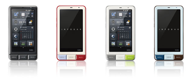
A `Smart' Smart Phone that is not iPhone


Buying an iPhone is like following the crowd. But other smart phones are not cool design-wise: they are all poorly copy-catting the appearance of iPhone. Those who want to be different face a particularly difficult dilemma when it comes to having a smart phone.

This is soon no longer true if you live in Japan. Check this out.

(But I don't live in Japan. I guess I go for iPhone White...)

Thursday, May 19, 2011

Work permit extension

As my work permit will expire at the end of August, I posted my application for its extension today. The Migrationsverket (Sweden's immigration office) apparently wants to pick a fight with foreign researchers. In the application form for foreign visiting researchers, one field to fill in is entitled:

Permanent address in Sweden

I moved in April of 2009, June of 2010, and September of 2010. I'm moving next month, at the end of July, and next May. What is my permanent address in Sweden?

(If you don't understand why I --- and most foreigners in Sweden --- have moved, and will move, so often in Sweden, see this post.)