Sunday, August 21, 2011

Akio Hirata versus Nendo at Spiral Garden


Back in June, the Spiral Garden in Omotesando of Tokyo featured a retrospective exhibition of hats designed by Akio Hirata. Hirata, aged 86, has been the top hat designer during the last few decades. This retrospective exhibition, however, turned out to be an unusual one, thanks to Ooki Sato, a leading designer under the alias of Nendo, in charge of exhibition design. It also attracted a lot of attention. The original 12-day exhibition period was extended for one week. See this page for the photos of exhibition.


About a month on, Excite Ism, probably one of the best online magazines in the field of design in Japan, published the interview of both Hirata and Nendo. It reveals behind-the-scene episodes of this exhibition, which is intellectually stimulating in terms of design process.

The basic idea of exhibition is to display Hirata's hats among milliards of white, ordinary, mass-produced hats so that Hirata's originality will be enhanced in the eyes of viewers. It is true that Hirata's hats are very original. It makes you realize that the shape of a hat can be so flexible even though the purpose of a hat is usually thought to constrain its shape. Originality will be enhanced if it's surrounded by ordinariness.

Another key word to describe Hirata's hats, says Nendo, is freedom. Not a single hat looks similar. Therefore, it is inappropriate to show his hats in a standard, one-dimensional way of exhibition. Viewers should freely walk around and should feel the way they feel about these hats, rather than the way the curator describes them.

So what Nendo came up with is a space with white, mass-produced hats floating in the air rather randomly as if these white hats were clouds in the air. Although the interview doesn't mention this, I imagine those mass-produced hats should have been nothing else but white. White is the color of nothing, the farthest end of the spectrum from Hirata's originality. Now, these white hats should be hung in the air, not on the ground or on the raised platform, because that's how a hat is worn. A hat is raised above the ground but hung in the air by the person who wears it. When these white hats are hung in the air in a way of freedom, it must have been a logical progression to see them as clouds. This analogy gives an extra meaning to the way viewers see these hats by random walk: straying amidst floating clouds, which is a day dream or a fantasia. And each of Hirata's hats is a fantasia.

The interview also reveals that Nendo's initial idea was actually modified and enhanced by Hirata, who slightly changed the design of these white hats. Which is not Nendo's intention. However, once these white hats came to life under the supervision of Hirata as the professional hat designer, the space itself also came to life. Once each white hat became beautiful, says Nendo, the whole space also became beautiful. This episode reveals that good design comes out of interactions between designers, not solely from one individual designer's own idea.

Another important element that led to the success of this exhibition is the material used for those white hats. Nendo chose Smash, which is "a unique non-woven polyester fabric developed by textile company Asahi Kasei" (in the words of a Wallpaper magazine article). Since Hirata often uses natural fabric, Nendo says, the latest chemical fabric would make a great contrast. But it turns out that Smash creates a nuanced light reflection just like the real clouds.

The gallery space is also unique in the sense that it's got a high ceiling and there is a spiral staircase that surrounds a spacious circular exhibition space at the rear. Thanks to this structure, viewers can observe the cloud of white hats from above as well as from below, allowing them to appreciate Hirata's hats even more because Hirata's design changes its appearance depending on from which angle you look at it.

Nendo's design concept of creating an exhibition space in stark contrast to Hirata's hats, Hirata's professionalism as a hat designer, the unique structure of the exhibition space, and the characteristics of the material used (Smash) all interact with each other, often unintentionally, to enhance the attractiveness of Hirata's hats to full extent.

I believe that good design is the one with solid logical backing. This exhibition is an example where such solid logical backing was created by unintentional interactions of designers, although such "unintentionality" probably didn't materialize without Nendo and Hirata's consistent approach to design.
Tuesday, August 16, 2011

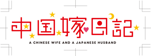
Chinese wife diary


This is the logo for a comic book written by a Japanese otaku man of age 40 who got married to a 20-something cute Chinese girl. The comic is about this Chinese wife who, by speaking broken Japanese (which makes her even cuter in the Japanese men's mind), makes the author (and the reader) notice the daily-life difference between Japan and China and what contemporary China feels like. Just releases last week, it has become the top selling comic book at the Amazon.co.jp online book store. The book is a collection of blog posts by the author, and so you can enjoy the cartoons here (not in China, though, as the hosting blog site is blocked by the Chinese government).

The logo, designed by manga comic book editor-designer Hideki Satomi, is praised by the author Junich Inoue as emanating the lovey-dovey feeling.

Why? What makes this logo lovey-dovey?

First of all, the font. It looks like the kind of letters young Japanese girls (maybe Chinese girls as well?) often write. The first two and the last two kanji letters do not enclose any space, suggesting something loose and sentimental.

Second, the five yellow stars (which must be those five stars in the Chinese flag), one red circle (which must come from the Japanese flag), a crescent (which may suggest sleeping at night together), and a heart that follows the kanji letter whose meaning is a wife) are all scattered around, to symbolize happiness as a result of sense, not of reason.

And finally, the central kanji letter whose meaning is a wife is slightly bigger than the other four, indicating that the husband has a slight inclination to show off how cute his wife is.

In addition, this kanji letter in the center is the combination of the letter signifying a woman (the left half) and the other meaning a home (the right half). By scaling this letter up a little bit, we feel the happiness of the guy who has got a woman at his home.

The color of red is used maybe because this is the color shared by both national flags of China and Japan, bearing some analogy to the international marriage or simply because the color of China to most Japanese people is simply red (not because they are communist but we traditionally associate China with red).

Monday, August 15, 2011

Why Apple?

If I remember correctly, their first sensation was the blue first-generation iMac. By now, almost every commercial image with a desktop computer (either in an advertisement or in a shop) comes with an iMac, not a Dell or a HP. Then the iPod, whose design has become the standard in the portable digital music player industry, and the iPhone, whose design has become the standard in the smart phone market, and most recently the iPad, whose design is quickly becoming the standard in the electronic book reader industry.

I usually go for what everyone else does not have. By now, however, my desktop PC is an iMac (both at home and in office); my laptop a MacBook Air; my portable digital music player an iPod Classic; my mobile phone an iPhone 4 White; and I'm now thinking of buying an iPad 2 after learning that Amazon's Kindle doesn't really satisfy my needs. And the reason is there's something irresistible about Apple's product design.

I always wonder why Apple always manages to come up with what can be called the universal design. All the other manufacturing companies end up copycatting Apple's design and end up with inferior design to Apple's (the only possible exception is Naoto Fukazawa's Infobar). I'm not an expert in industrial design. In particular, I have no knowledge of electronics. So it is impossible to answer this question in a fundamental way. But that doesn't discourage me from thinking about this puzzle.

One of the keys seems to be thinness. Apple makes a lot of engineering effort to make products thinner than those produced by competitors. And thinness appeals to us as consumers, perhaps because almost every electronics product wasn't thin before. What's attractive as an image often coincides with what's not been available so far.

But this explanation seems only part of the whole story. It's probably also about simplicity or simple-looking appearance. Electronic gadgets tend to have multiple functions, which leads to too many bottoms on their surface. But perhaps not a single consumer will use them all. There is a gap between how consumers use the product and what the product looks like. Apple successfully narrows this gap. It's perhaps nothing surprising that Naoto Fukazawa manages to come up with a smart phone design that goes on par with iPhone, because that's exactly his design philosophy: narrowing the gap between how consumers use the product and what the product looks like.

(To be continued.)

Friday, August 05, 2011

How was flash memory invented?

Fujio Masuoka, a former is the inventor of flash memory, the data storage chip used worldwide in mobile phones, digital cameras, and MP3 players. The August 1st evening issue of Asahi Shinbun (a Japanese newspaper) features his interview in which he reveals how he invented flash memory.

When he joined Toshiba, he first worked at the research and development department. He invented a high-performance memory chip, but it didn't sell at all. He then asked for the transfer to the sales and marketing department in order to sell the chip on his own.

He flied to the United States and visited many computer companies. But he failed and got transferred back to the R&D department within a year.

But this experience let him learn one thing. American companies repeatedly told him, "We don't need a high-performance chip. We just need the minimum level of quality. Don't you have a chip that's much cheaper?"

This led him to come up with an idea to design a chip that "must be erased in fairly large blocks before these can be rewritten with new data" (from Wikipedia on flash memory), which is clearly less functional but reduces the cost of production by more than 75 percent.

What I find interesting about this episode is that it was Americans' (or Westerners' in general, I would say, in comparison to Japanese) mentality that allowed him to invent flash memory. Japanese people tend to pursue the best quality products while Westerners (Americans in particular, I guess) are often satisfied with something that is just functional enough for daily use. If he sticks to this Japanese mentality, he wouldn't have been able to invent flash memory.

Thursday, August 04, 2011

Some discoveries in Stockholm

I've discovered a few things in Stockholm recently: one excellent budget eatery, one stylish and cosy outdoor bar, and one cool store for babies and children.

The excellent budget eatery is Serrano. This is a proper Mexican lunch place. They stuff food ingredients into burritos and quesadilla after you order. They come with baby leaf salad. An extra 10 krona buys you a cup of mixed tropical fruit juice. My fajita burrito makes me smile (which is rare when I eat lunch in Stockholm). Both of my two friends eating together also say they like the food. In the US, this style of Mexican lunch place is extremely popular. Finally, Stockholm has one. (Forget the ubiquitous Taco Bar. It's just no contest.) Plus, it opens until 8 or 9 pm (which is very unusual for this kind of budget restaurant in Stockholm). It's located near Central Station and inside the Liljeholmen Torget shopping mall.

The stylish and cosy outdoor bar is Zeeside (see also an article by the Spotted By Locals blog). It's located on the shore of the newly developed neighborhood of Henriksdalshamnen. It can be approached by a boat from Luma in Hammerby sjöstad or from the southeastern shore of Södermalm. The vibe is just awesome with a great view of the water sandwiched by Södermalm and Hammerby sjöstad, the white bar counter evoking the sense of being on a beach, and white, orange, and pink design chairs (which are not only good-looking but also comfortable). There's no cheesy music in the background. But most importantly, the bar foods are fantastic. My tuna salad (with avocado, watermelon, pumpkin, etc.) is something that doesn't even remotely resemble the foods served elsewhere in Stockholm, in terms of the freshness of the ingredients and the creativity of choosing what to mix in a single plate. Both of my two former New Yorker friends eating together are also impressed by their delicately-made burgers. On a long bright evening of Stockholm's summer, this bar just allows you to exploit the true potential of the Swedish capital. You can't really find something similar to this in other cities in the world.

Finally, the cool shop for babies is Sprall, where I bought a gift for the baby girl of my friend in Tokyo. The design of baby bottles and bibs is cute and Scandinavian. But this mushroom rubber doll really beats everything else. When a baby grab this doll, it cries. And the way it unfolds after a baby crushes it is kind of artistic. Its branches are located near Östermalmstorg and inside the PUB department store on Hötorget.

I don't know when Sprall was opened, but Serrano and Zeeside were opened within the past one year. Increasingly, Stockholm sees more and more cool places popping up. When I moved to this city four years ago, it wasn't like this. Most of my favorite places in Stockholm weren't there at that time.