Tokyo Midtown revisited
For the second time I visit Tokyo Midtown. I now come to like its decor. It's not conspicuous, but getting used to it reveals its aesthetics. See these pictures:


And Tokyo Midtown is not just about its appearance:
Edo-kirian
It's near 2pm when I arrive at Tokyo Midtown. I haven't had lunch yet. Among several Japanese restaurants inside the Midtown, Edo-kirian becomes my lunch place today. It's a soba noodle place. The price is very reasonable. For 1080 yen (6.66 euro), I have ebi kakiage seiro (cold soba noodle served on a bamboo steamer with shrimp and sliced vegetable tempura). I'm not particularly a fan of soba noodle, but I'm impressed by the consistent texture of the soba noodle at this place. They also serve soba-yu (hot water used for boiling soba noodle). We drink this after eating soba noodle.
Hinokicho Park
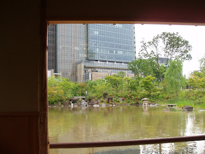
With the full stomach, I take a walk to Hinokicho Park. It is a Japanese style garden, but the garden was just constructed along with the creation of Tokyo Midtown. So it only gives me a superficial impression. Having said that, sitting on a wood bench under the roof of azumaya (a wooden hut meant for garden visitors to take a rest), watching a spacious pond with Tokyo Midtown's contemporary high-rise buildings behind, and listening to the sound of streaming water in the garden makes me relax in the middle of the bustle of megalopolis Tokyo. 
Next to Hinokicho Park lies Midtown Garden, which features avant-garde swings and slides for children.
 Walking on a slowly curved footpath leads to the low-rise concrete building of 21_21_Design_Sight, designed by Tadao Ando. The curvature of the footpath is well-designed so the horizontal spanning of Ando's building is fully appreciated.
21_21_Design_Sight
The current exhibition at 21_21_Design_Sight is "XXIst Century Man" curated by Issey Miyake. No photo is allowed at this gallery, but Excite Ism, a Japanese web magazine on design, takes picture of most works on display. Below I link these pictures from the title of each work (except for Tim Hawkinson's Dragon, whose picture comes from The Huffington Post.
There are several key words popping up in my mind while exploring this exhibition. First, recycling. Issey Miyake's "Myth of the 21st Century" uses pieces of paper used during designing clothes. "Cabbage Chair" by nendo utilizes used pleated paper. Koutarou Sekiguchi's "It's a departure at a bright night." is made of only newspaper and duct tape. "Dunan Endeavor" by Yazou Hokama also recycles paper used as a container for industrial material.
Next, what can be called the 21st century version of antimodernism. Ron Arad's "PizzaKobra" reveals a beautiful snake as a result of pursuing the state-of-the-art technology. "The Wind" by Issey Miyake Creative Room transforms parts of Dyson cleaners into human beings who wear the clothes inspired by parts of Dyson cleaners. Ben Wilson's "Monocycle" puts a driver inside the large single wheel, rather than on the top of it.
Third, the creation out of nothing. "Dragon" by Tim Hawkinson is not really a picture of a dragon if you look at it closely, but if you look at it from a distant, it's nothing else than a dragon. "Beginning of Time" by Yasuhiro Suzuki consists of two bronze branches which produce water out of nothing (because we do not see water vapour in the air: bronze induces dew condensation).
Finally, a human body. Isam Noguchi depicts "Standing Nude Youth" in ink brush painting. Stickman creates "Dui Seid" with wood branches as bones and blood vessels.
What should we take from these? Issey Miyake writes, "It is only through the miracles of creativity and imagination that this Earth will see dreams realized..." With environmental issues more serious than ever, we need to be more aware of ourselves as human beings in relation to the nature and what modernism brings to us. And only creation beyond most people's imagination can achieve it. That's my take.
It is a very well-curated exhibition. It would be perfect if visitors couldn't see Koutarou Sekiguchi's "It's a departure at a bright night." until the very end. Due to the space limitation, I suppose, this dream-incubating work of art has to be placed in an area where visitors go downstairs to start a visit. The sight of Sekiguchi's work at the beginning undermines the role of this work as a burst of hope after deep consideration.
Koots Green Tea
After being slightly tired from appreciating art and design, a Japanese tea cafe with an interesting concept refreshes my mind. Koots Green Tea is a perfect copycat of Starbucks in terms of the cafe decor and the presentation of drinks. But it doesn't serve espresso but matcha green tea. Matcha latte comes in several forms including the one topped up by kuromitsu (thick brown sugar in Japanese style) and kinako (soybean flour). Koots's version of Frappuccino is called Korichio (but not espresso but matcha green tea, red bean, or black sesami). Instead of sandwiches, they sell onigiri (rice balls wrapped in sea weed). Instead of biscotti, various Japanese sweets can be ordered. What's interesting is you can order an extra shot of matcha. I love this ridiculousness.
In addition, Koots sells fantastic matcha financiers. This is how Japanese people take French pastry to a next level.
Shopping
Although I was disappointed by the overall inferiority of interior design shops in Tokyo Midtown compared to those in Stockholm, there are two shops worth revisiting. Time & Style sells stylish towels. Hashicho sells myriads of Japanese chopsticks including traditional ones with contemporary design twists.
No comments:
Post a Comment