Showing posts with label design. Show all posts

Saturday, December 31, 2011

Grand cleaning

In Japan, the last few days in December is when people clean up their home on an extensive scale (we call this oo-soji or grand cleaning). And today I helped my parents do this grand cleaning, well, only a little bit. :P

Which reminds me of what I always don't understand: why is any modern house designed to be difficult to clean up? Perhaps talented, influential house interior designers in the Western world only have wealthy clients who can afford hiring house cleaners and thus never care about whether it is easy to clean.

Saturday, November 12, 2011

Another discovery in Stockholm

I've finally discovered a Stockholm cafe that I like in every aspect: coffee, food, the interior, and the appropriate level of business (ie. some seats available).

It was totally by chance for me to discover a cafe called Foam. The other day I was walking on Karlavägen, a pleasant boulevard in the poshest district of Stockholm known as Östermalm. I noticed a rusty blue metallic door with cute-looking tiny windows in an otherwise standard-looking building on the street corner.


It looks like an entrance to a hip bar or something. But it was in the early afternoon, and I saw some people entering and exiting from the place. Out of curiosity, I entered the place.

Inside spreads the interior rather different from what I imagined from the entrance door appearance. I immediately liked it without understanding why. Customers are all well-groomed and trendy types. I just had a cup of espresso quickly. It tasted slightly sour, but within an acceptable range (unlike coffee served by many other cafes in Stockholm).

Today, I revisited the cafe for lunch. I didn't expect much in terms of foods, honestly speaking. But my sourdough bread toast sandwich with tomato and mozzarella, when served, smelled very nice. I never had this pleasant smell when I had a toast sandwich in Stockholm. It turns out that they use tapenade (Provencal paste of olives, capers, and anchovies) to make the otherwise standard toast sandwich a bit different. (Sourdough bread is so popular in Stockholm right now). And it tasted excellent. Accompanying salad was also pleasantly fresh (which is not easy in Stockholm's winter).

And a glass of cafe latte tasted very good. It's unusual for me to get satisfied from both foods and coffee in a cafe in Stockholm (the only exception is Mellqvist Kaffebar).

Then I looked around, trying to understand why I like this cafe's interior. The cafe comprises three materials that would usually look mutually incompatible: birch wood, grey concrete, and shocking pink plastic and textile. (It may not be birch or plastic, but what's important is what they look like.) Each material dominates one of the three sections in the cafe, and what's stunning is that the diagonal boundary between these sections (also the edgy shape of the wooden counters in the concrete area) makes the transition very smooth. As a result, the cafe has an integrated atmosphere that's unique. Randomly hung hand-blown glass lamps just enhance the vibe.


Depending on your mood, you can choose which section of the cafe to sit down. If you want to relax, go to the birch section.
If you're passionate, have a seat at the shocking pink section.
If you feel inorganic and modernist, stay at the concrete area. The presence of the other two sections, however, adds the cool feeling to wherever you settle.

Once you understand this, the totally-different looking rusty-blue entrance door now makes sense. It cannot be birth, concrete or pink. It should be something totally different AND provocative enough for walkers-by to peek in (as I did). Once you open the door, you cannot help saying, "Wow."

The cafe interior was designed by Note Design Studio.

Sunday, August 21, 2011

Akio Hirata versus Nendo at Spiral Garden


Back in June, the Spiral Garden in Omotesando of Tokyo featured a retrospective exhibition of hats designed by Akio Hirata. Hirata, aged 86, has been the top hat designer during the last few decades. This retrospective exhibition, however, turned out to be an unusual one, thanks to Ooki Sato, a leading designer under the alias of Nendo, in charge of exhibition design. It also attracted a lot of attention. The original 12-day exhibition period was extended for one week. See this page for the photos of exhibition.


About a month on, Excite Ism, probably one of the best online magazines in the field of design in Japan, published the interview of both Hirata and Nendo. It reveals behind-the-scene episodes of this exhibition, which is intellectually stimulating in terms of design process.

The basic idea of exhibition is to display Hirata's hats among milliards of white, ordinary, mass-produced hats so that Hirata's originality will be enhanced in the eyes of viewers. It is true that Hirata's hats are very original. It makes you realize that the shape of a hat can be so flexible even though the purpose of a hat is usually thought to constrain its shape. Originality will be enhanced if it's surrounded by ordinariness.

Another key word to describe Hirata's hats, says Nendo, is freedom. Not a single hat looks similar. Therefore, it is inappropriate to show his hats in a standard, one-dimensional way of exhibition. Viewers should freely walk around and should feel the way they feel about these hats, rather than the way the curator describes them.

So what Nendo came up with is a space with white, mass-produced hats floating in the air rather randomly as if these white hats were clouds in the air. Although the interview doesn't mention this, I imagine those mass-produced hats should have been nothing else but white. White is the color of nothing, the farthest end of the spectrum from Hirata's originality. Now, these white hats should be hung in the air, not on the ground or on the raised platform, because that's how a hat is worn. A hat is raised above the ground but hung in the air by the person who wears it. When these white hats are hung in the air in a way of freedom, it must have been a logical progression to see them as clouds. This analogy gives an extra meaning to the way viewers see these hats by random walk: straying amidst floating clouds, which is a day dream or a fantasia. And each of Hirata's hats is a fantasia.

The interview also reveals that Nendo's initial idea was actually modified and enhanced by Hirata, who slightly changed the design of these white hats. Which is not Nendo's intention. However, once these white hats came to life under the supervision of Hirata as the professional hat designer, the space itself also came to life. Once each white hat became beautiful, says Nendo, the whole space also became beautiful. This episode reveals that good design comes out of interactions between designers, not solely from one individual designer's own idea.

Another important element that led to the success of this exhibition is the material used for those white hats. Nendo chose Smash, which is "a unique non-woven polyester fabric developed by textile company Asahi Kasei" (in the words of a Wallpaper magazine article). Since Hirata often uses natural fabric, Nendo says, the latest chemical fabric would make a great contrast. But it turns out that Smash creates a nuanced light reflection just like the real clouds.

The gallery space is also unique in the sense that it's got a high ceiling and there is a spiral staircase that surrounds a spacious circular exhibition space at the rear. Thanks to this structure, viewers can observe the cloud of white hats from above as well as from below, allowing them to appreciate Hirata's hats even more because Hirata's design changes its appearance depending on from which angle you look at it.

Nendo's design concept of creating an exhibition space in stark contrast to Hirata's hats, Hirata's professionalism as a hat designer, the unique structure of the exhibition space, and the characteristics of the material used (Smash) all interact with each other, often unintentionally, to enhance the attractiveness of Hirata's hats to full extent.

I believe that good design is the one with solid logical backing. This exhibition is an example where such solid logical backing was created by unintentional interactions of designers, although such "unintentionality" probably didn't materialize without Nendo and Hirata's consistent approach to design.

Tuesday, August 16, 2011

Chinese wife diary


This is the logo for a comic book written by a Japanese otaku man of age 40 who got married to a 20-something cute Chinese girl. The comic is about this Chinese wife who, by speaking broken Japanese (which makes her even cuter in the Japanese men's mind), makes the author (and the reader) notice the daily-life difference between Japan and China and what contemporary China feels like. Just releases last week, it has become the top selling comic book at the Amazon.co.jp online book store. The book is a collection of blog posts by the author, and so you can enjoy the cartoons here (not in China, though, as the hosting blog site is blocked by the Chinese government).

The logo, designed by manga comic book editor-designer Hideki Satomi, is praised by the author Junich Inoue as emanating the lovey-dovey feeling.

Why? What makes this logo lovey-dovey?

First of all, the font. It looks like the kind of letters young Japanese girls (maybe Chinese girls as well?) often write. The first two and the last two kanji letters do not enclose any space, suggesting something loose and sentimental.

Second, the five yellow stars (which must be those five stars in the Chinese flag), one red circle (which must come from the Japanese flag), a crescent (which may suggest sleeping at night together), and a heart that follows the kanji letter whose meaning is a wife) are all scattered around, to symbolize happiness as a result of sense, not of reason.

And finally, the central kanji letter whose meaning is a wife is slightly bigger than the other four, indicating that the husband has a slight inclination to show off how cute his wife is.

In addition, this kanji letter in the center is the combination of the letter signifying a woman (the left half) and the other meaning a home (the right half). By scaling this letter up a little bit, we feel the happiness of the guy who has got a woman at his home.

The color of red is used maybe because this is the color shared by both national flags of China and Japan, bearing some analogy to the international marriage or simply because the color of China to most Japanese people is simply red (not because they are communist but we traditionally associate China with red).

Monday, August 15, 2011

Why Apple?

If I remember correctly, their first sensation was the blue first-generation iMac. By now, almost every commercial image with a desktop computer (either in an advertisement or in a shop) comes with an iMac, not a Dell or a HP. Then the iPod, whose design has become the standard in the portable digital music player industry, and the iPhone, whose design has become the standard in the smart phone market, and most recently the iPad, whose design is quickly becoming the standard in the electronic book reader industry.

I usually go for what everyone else does not have. By now, however, my desktop PC is an iMac (both at home and in office); my laptop a MacBook Air; my portable digital music player an iPod Classic; my mobile phone an iPhone 4 White; and I'm now thinking of buying an iPad 2 after learning that Amazon's Kindle doesn't really satisfy my needs. And the reason is there's something irresistible about Apple's product design.

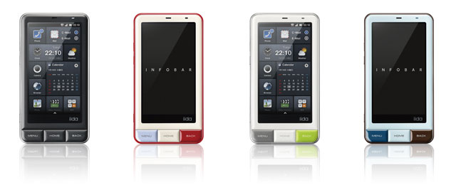
I always wonder why Apple always manages to come up with what can be called the universal design. All the other manufacturing companies end up copycatting Apple's design and end up with inferior design to Apple's (the only possible exception is Naoto Fukazawa's Infobar). I'm not an expert in industrial design. In particular, I have no knowledge of electronics. So it is impossible to answer this question in a fundamental way. But that doesn't discourage me from thinking about this puzzle.

One of the keys seems to be thinness. Apple makes a lot of engineering effort to make products thinner than those produced by competitors. And thinness appeals to us as consumers, perhaps because almost every electronics product wasn't thin before. What's attractive as an image often coincides with what's not been available so far.

But this explanation seems only part of the whole story. It's probably also about simplicity or simple-looking appearance. Electronic gadgets tend to have multiple functions, which leads to too many bottoms on their surface. But perhaps not a single consumer will use them all. There is a gap between how consumers use the product and what the product looks like. Apple successfully narrows this gap. It's perhaps nothing surprising that Naoto Fukazawa manages to come up with a smart phone design that goes on par with iPhone, because that's exactly his design philosophy: narrowing the gap between how consumers use the product and what the product looks like.

(To be continued.)

Thursday, June 02, 2011

A `Smart' Smart Phone that is not iPhone


Buying an iPhone is like following the crowd. But other smart phones are not cool design-wise: they are all poorly copy-catting the appearance of iPhone. Those who want to be different face a particularly difficult dilemma when it comes to having a smart phone.

This is soon no longer true if you live in Japan. Check this out.

(But I don't live in Japan. I guess I go for iPhone White...)

Friday, April 22, 2011

The Future of Credit Unions

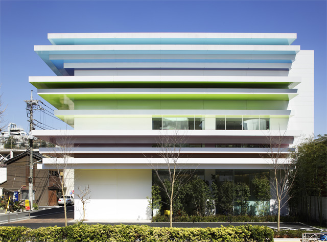
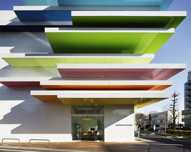
This is mind-blowing. Can you imagine that this building is a credit union branch?

The Sugamo Shinkin Bank's Shimura branch in a suburb of Tokyo, designed by Emmanuel Moureaux and opened last month, perhaps represents the future of credit union branches.


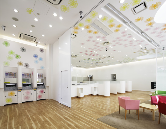
Even the interior of the branch is unexpected for a credit union.

Notice ATM machines on the left

Some of the other branches of Sugamo Shinkin Bank are also designed by this architect, judging from her own website.

(The photos in this post are all linked from Excite Ism.)

Saturday, March 26, 2011

H&M Spring 2011 ad campaign


Just when a "spring" arrived in Stockholm earlier this week (NB: temperature above 5 degrees Celsius feels like a spring in Sweden), H&M launched its new ad campaign. The ads like those two shown above are everywhere in Stockholm.

And I liked these two pictures without knowing that the model is a super famous fashion model named Gisele Bundchen. Was it because of her celebrity aura or because of H&M's clothes? You might think it was the former, but I actually think it was the latter. As evidence I didn't like her other ad photos.

A loose silhouette accentuated with a couple of tightened parts (the top and bottom edges of the jumpsuit or the waist part of the dress) is certainly IN this season. Those girls who manage to incorporate this rule in their fashion clearly stand out in the crowd in Stockholm.

It's interesting to see if girls in Stockholm will flock to this trend or keep their 4-year-old (at least) trend of wearing a cropped black jacket with a long white t-shirt covering the whole hip (with black shiny leggings attached since two years ago), when the real spring finally arrives in late April.

Friday, June 18, 2010

araisara

From this week's edition (June 14, 2010) of Nikkei Weekly...

Having been raised in Beijing, Sara Arai acquired the ability to combine the cultures of China and Japan --- sweeping dynamism and delicate beauty --- to create original fashions. ... In [her latest collection for autumn/winter 2010-2011], Arai used a traditional Japanese dying technique called yohenzome, which gives color a unique characteristic. This little-known technique is said to have its origins in the early Heian period (794-1185). Yohenzome-dyed fabrics seem to change color when light hits them from different angles. ... Under fluorescent light, a yohenzome article that is red under the sun changes to black.

I wanna see her collection in video, not in photos, as photos cannot express the changing-color feature of yohenzome (陽変染). Unfortunately, the video of her latest collection doesn't seem to be available online. (The photos are here.)

This is mind-blowing. The technique dating back to more than 900 years ago is revived to add a 4th dimension (time) to the three dimensional world of fashion with the color created by fluorescent light beyond the imagination of the original inventor of this technique more than 900 years ago.

I love this kind of attempt to broaden one's imagination.

The official website of araisara is here.

Saturday, January 30, 2010

Camper Regent Street

Visiting Camper's flagship store in London at 207-209 Regent Street is a joy. Opened on September 25, 2009, the Spanish shoe brand's shop is designed by Japanese designer Tokujin Yoshioka. Customers trying on shoes sit on his critically-acclaimed "Bouquet by Moroso" chairs made of paper tissues of reddish colors. One side of the wall is also covered with crimson paper tissues. Amazingly, Yoshioka's design is well matched with our common image of Spain, where Camper comes from. The place is perhaps the most delightful and thoughtful shoe store in the world.
 

V&A Medieval and Renaissance Gallery

The much-hyped medieval and renaissance gallery, opened last December, at the Victoria and Albert Museum (aka V&A) indeed beautifully showcases European design from the Middle Ages. Or I should not use the term "showcase" because they do much more than simply putting items in showcases.

Enter the museum from Cromwell Road and take the staircases on the right downstairs. Here you learn Romanesque and Gothic styles of design visually, because the first thing you will see is:

Then in the next room you encounter:


Like other newly-renovated galleries such as The Jameel Gallery on Islamic art and The Dorothy and Michael Hintze Galleries on sculpture, the V&A is very good in this gallery, too, at displaying objects in a way that enhances their attractiveness: 
Go upstairs to the ground floor. There the V&A has transformed the gallery space into a medieval court yard with the glass roof letting the sunlight fall. The view from the first floor balcony (pictured right) is elegant. 
The first floor gallery rooms feature Renaissance art. Here I do feel a completely different atmosphere, and I personally find it uneasy. The Renaissance style is too well-organized. It even feels a bit pretentious. That's my personal take, but it also means that the V&A succeeds in transforming the general theme underlying Renaissance into the gallery's vibes before explaining what Renaissance is about in words.

Before encountering the V&A during my life in London, I didn't understand the merit of visiting museums at all. The V&A changed my idea of a museum completely. They display objects as if they were decorating the living room. They present the whole gallery space as something pleasant to stay in. That helps visitors really appreciate the displayed objects. If you hate museums, think again when it comes to the V&A.

Sunday, December 27, 2009

Verner Panton


(The photo taken from Excite Ism)

I didn't know who Verner Panton was. But this Danish interior designer is apparently one of the must-know persons in the history of design, and the picture above (used in the flyer for the exhibition held at Tokyo Opera City Art Gallery until today) is intriguing enough for me to decide to visit the Gallery just one hour before the closing time.

Skipping the first section on the biography of Verner Panton and his early works on display (which I think is a bit boring way of introducing the whole exhibition), the corn chairs and other geometrically-shaped chairs catch my eyes:
(The photo taken from Excite Ism)

Using the inverted circular cone as a chair is the idea Panton came up with back in 1958. It is actually a functional idea. A circular cone has a flat surface that can be used as a seat and the cone part can be used as a support for the chair.

This obsession with a chair that doesn't have a standard form culminates into the Panton Chair (the photo to the right, taken from Wikipedia):

This chair is familiar to me because I often have lunch by sitting on this chair at the cafe in my Stockholm workplace. The exhibition tells visitors that Panton invented the concept in 1965. Technology at that time did not allow the concept to materialize in the commercially viable form. Only in the early 1990s, plastic materials became sturdy enough to realize this chair shape durable for a long time. Usually, people whose idea is too advanced are only cherished in history. In the case of Panton, we can appreciate his idea in real time, for example, at the cafe in my workplace.

What really blows my mind, however, is his talent in space design. The exhibition replicates two installations he produced back in 1970. The first is Phantasy Landscape, shown in the picture at the top of this blog entry which does not really tell what this is about. It's a cave-like structure made of foam rubber. Visitors can sit down, lie down, and even sleep. What strikes me is that this space makes people look happy. When I enter into this cave, quite a few people are sitting, chatting, and sleeping. The crowd usually looks a bit annoying and can be intimidating. Here in this cave these people look beautiful. This is an installation that comes to fruition when it interacts with people, a very popular idea for today's art installation. But Panton did this almost 40 years ago.

The second mind-blower is 3-D Carpet "Wave". A huge red carpet that has wave-like humps, which can be used as a chair, a sofa, or a pillow. Visitors sit down and lie down on their back on this carpet to watch a film on Verner Panton on the wall screen. The view of this installation is again a very pleasant experience. People apparently enjoy it. You feel it by looking at their faces. And I myself enjoy chilling on a wave-hump.

Some nightclubs and bars should adopt these two spaces designed by Panton. Actually, some of the other spaces produced by Panton appear to have influenced the design of some nightclubs and bars today. The decor of Cocoon in Frankfurt and Zouk in Singapore, I believe, has some traces of his design, if not intentional.

On the way home, I read a giveaway leaflet for this exhibition. I learn the following behind-the-curtain episode. Directed by the Vitra Design Museum in Germany, the exhibition has been on the world tour since 2000. However, the Tokyo version is curated quite differently from the earlier exhibitions in other countries. While Panton's works were on display chronologically and often in the same room in those earlier exhibitions, Ichiro Katami and Uichi Yamamoto, the directors for the Tokyo exhibition, thought such a way of exhibition wouldn't be effective enough to deliver Panton's pursuit of fantasy space to visitors. Consequently, at Tokyo Opera City Art Gallery, they split the exhibition space into several separated booths each of which represents different philosophies Panton embodied into his works. Plus, the 3-D Carpet replica was made specially for this Tokyo exhibition. In other words, people in other countries who visited this exhibition were unable to experience that happy atmosphere.

Another reason to believe that Tokyo is the world's most interesting city.

Saturday, October 31, 2009

2x4 versus Herzog and de Meuron

This is how Graphic artist group 2x4 transformed Herzog & de Meuron's Prada Omotesando in Tokyo:

(Photo source: Nikkei Woman)

Isola Linear

A kitchen suggested by Toyo Kitchen from Japan.
(The image taken from Excite Ism Concierge, October 30, 2009)

Friday, October 02, 2009

Gareth Pugh from Paris Collection Spring 2010


FT Fashion Editor Vanessa Friedman at FT praises Gareth Pugh's collection. (The image is taken from Style.com.)

Monday, August 03, 2009

Good design helps newspapers

A TED talk (February 2009) by the designer who revolutionalized newspapers in Central and Eastern Europe.


I would add that this guy's design of his presentation slides is also excellent.

Saturday, July 25, 2009

Tokyo Subway Map for your iPod


I just discovered Gizmobies. It's a stylish protector skin for iPod, iPhone, Blackberry, and Nintendo DS. This is what I wanted for my iPod Classic. And my hesitation to buy an iPhone due to its rather ugly design will go away with Gizmobies.

It originates from America, and its Japanese store has the "Japan-only" patterns. I hope Scandinavian designers will soon join the bandwagon. They should do a better job.

And what's surprising to me is that one of the patterns available in US is the Tokyo Subway Map (see above). This is a cultural shock to me.

London's tube map is a design icon.


On the other hand, I always thought Tokyo's counterpart was ugly.


But for Americans, Tokyo is cool, and so its subway map is also cool, as it seems.

Monday, April 06, 2009

Cassina Ventaglio


(Photo source: Cassina's official Japanese website)

A desk designed by Charlotte Perriand in 1972.

Monday, January 12, 2009

Japanese chandelier


Designed by Yumi Terauchi.

(These photos are taken from Excite Ism Concierge, January 12, 2009.)

Saturday, December 06, 2008

Designer shaver


Brought to you by Hitachi. (The above photo is taken from Amazon.co.jp).